Introducing the Seasonal Spiral tool (GA4 + Search Console)
Spot weekly patterns and seasonal trends in your GA4 and Search Console data with an interactive spiral visualisation.


The Seasonal Spiral is a free, browser-based tool for visualising daily GA4 and Search Console data. Connect your own account to explore weekly patterns and seasonal trends in a format that line charts tend to hide.
What is the Seasonal Spiral?
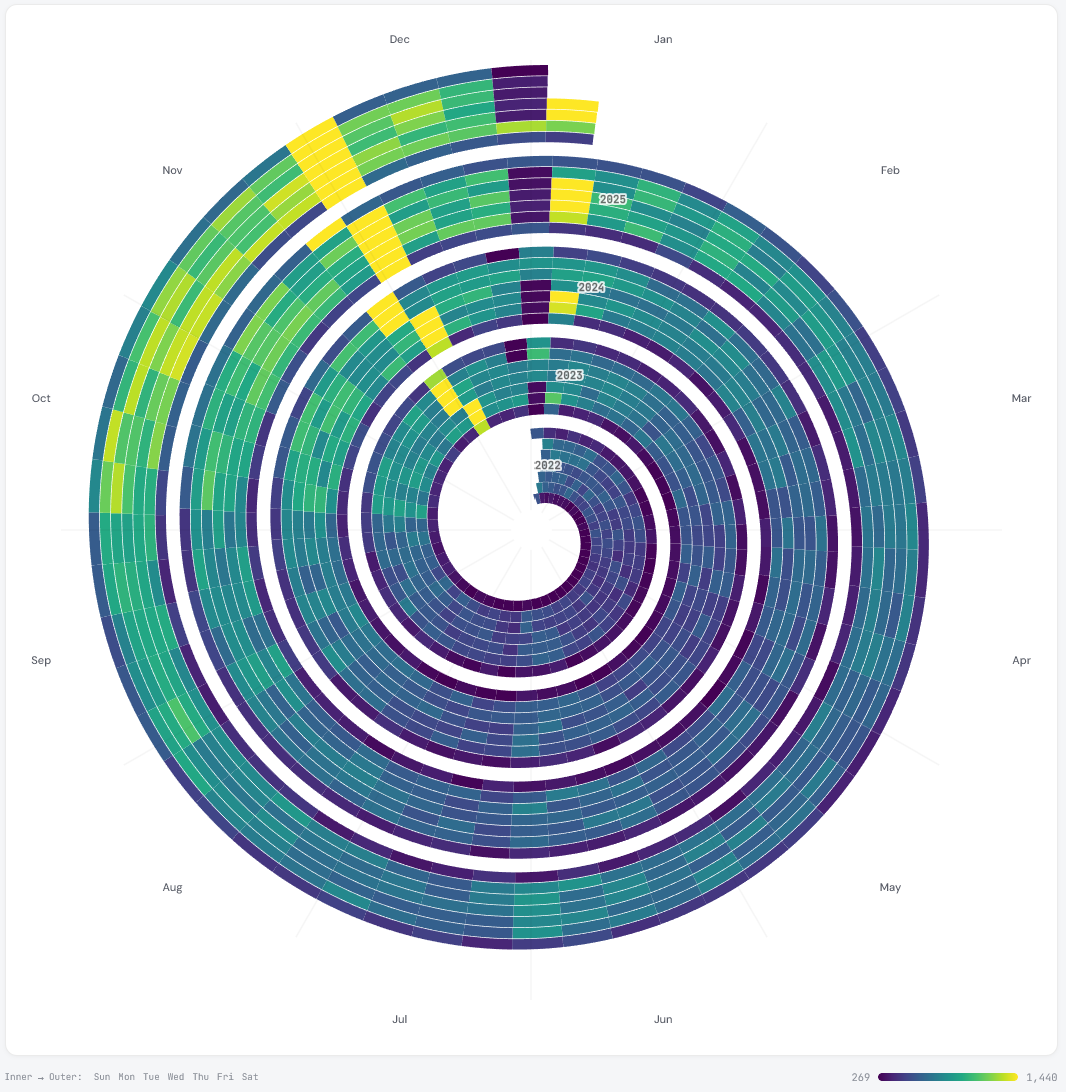
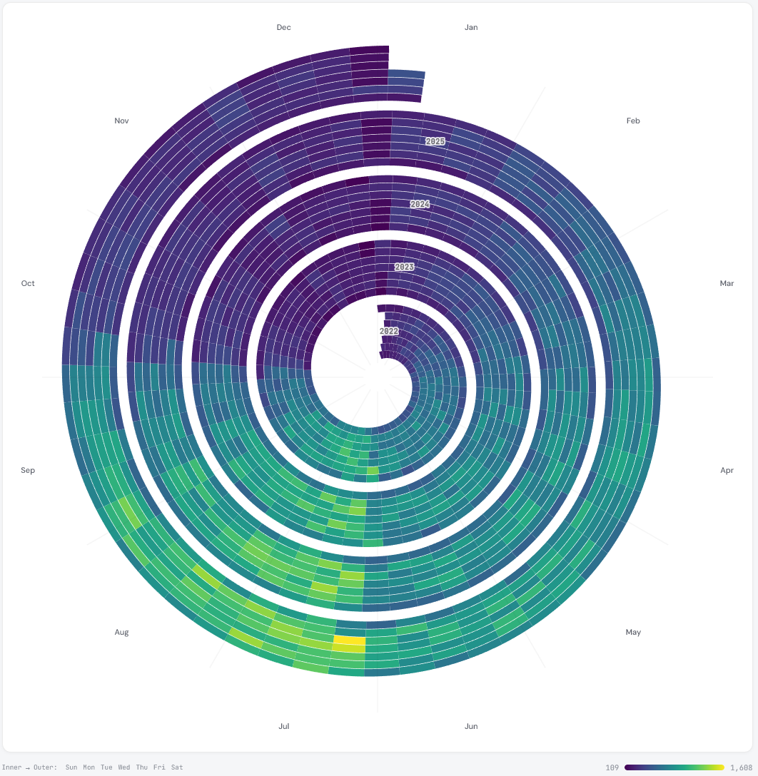
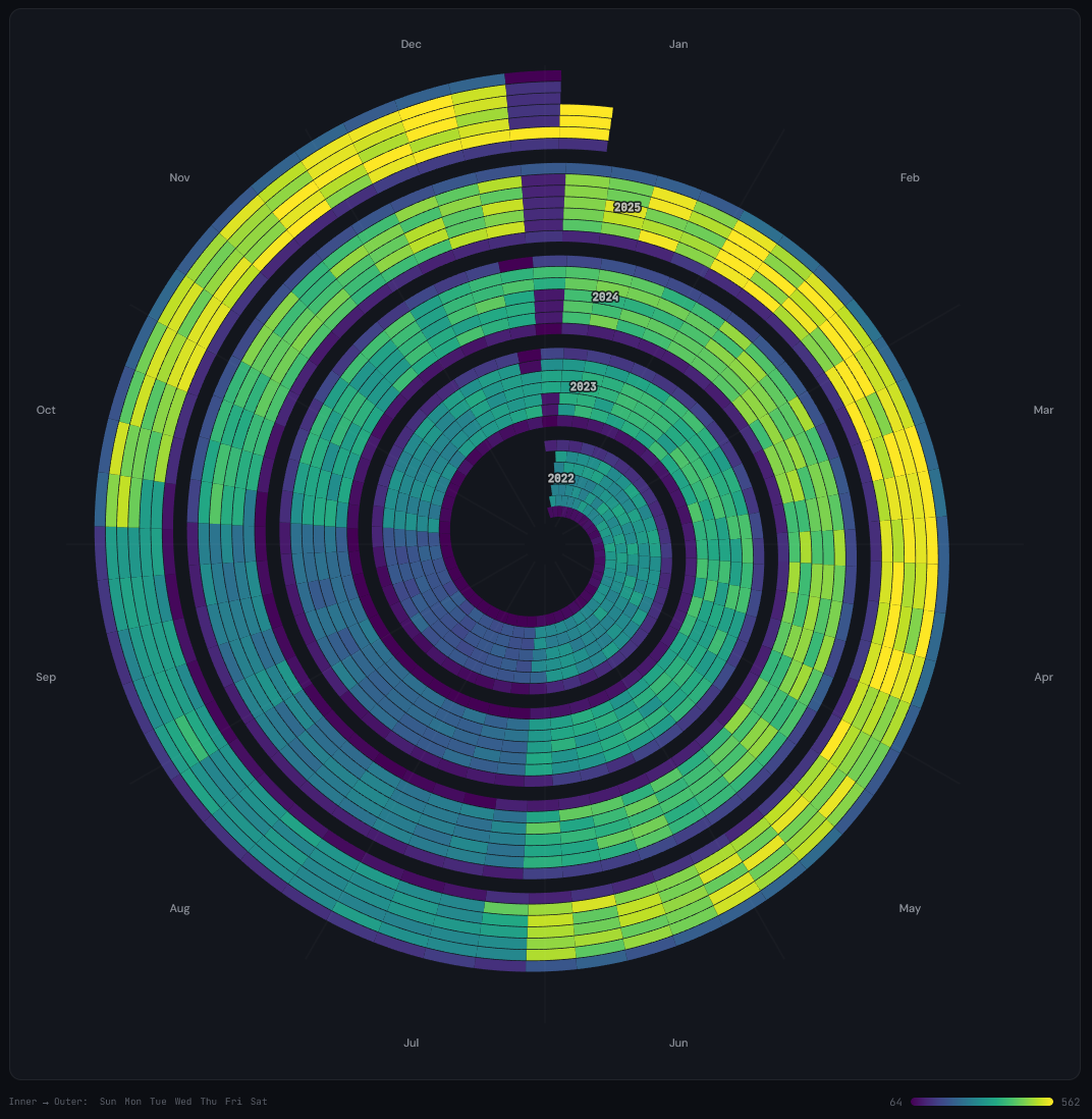
The Seasonal Spiral takes daily data and plots it as a spiral rather than a line chart. Each full revolution around the spiral represents one year. Within each revolution, the spiral is divided into seven lanes running from the inner edge to the outer edge - one for each day of the week, Sunday through Saturday. The colour of each segment represents the metric value for that day.
The format puts two things side by side at once: weekly patterns (which days consistently perform better or worse) and year-over-year trends (whether the same period this year looks different to last year). A standard line chart can show both, but the spiral layout makes weekly and seasonal rhythm more immediately visible - particularly when you have two or more years of data to compare.
Data sources
The tool currently supports two connected data sources and three built-in sample datasets.
Google Analytics 4
Connect your Google account to pull in up to five years of daily data from any GA4 property you have access to. Once connected, you can visualise four metrics:
- Sessions - total sessions per day
- Transactions - e-commerce transaction count per day
- Revenue - total revenue per day
- Event count - count of a specific event, filtered by event name
The event count option is flexible. Enter any event name - for example generate_lead, add_to_cart, or a custom event - to visualise how that action has trended over time.

Google Search Console
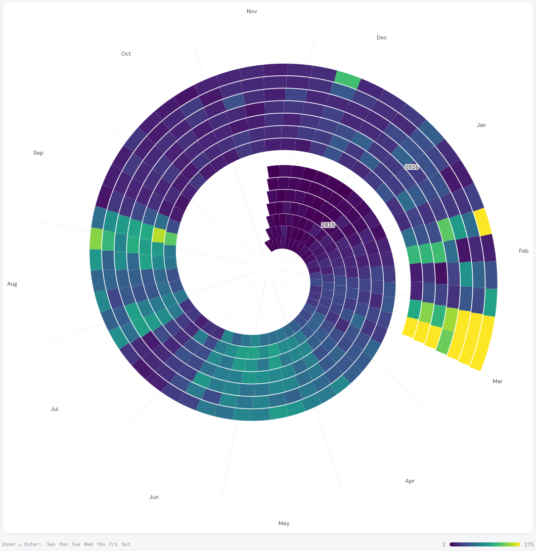
Connect to Search Console to visualise up to 16 months of daily data. The available metrics are total clicks and total impressions from Google Search.
Search Console data is particularly useful for SEO analysis. The spiral format makes it straightforward to identify seasonal search demand - you can see at a glance whether organic clicks in January this year are above or below the same period last year, and whether there are consistent weekly rhythms in organic traffic. Many sites see a clear drop at weekends, and the spiral makes this pattern easy to spot. Comparing clicks against impressions separately can also surface changes in click-through rate over time, which a flat trend line can obscure.
Sample datasets
If you want to explore the tool without connecting an account, three sample datasets are available from the data source selector:
- E-commerce - simulated sessions data with Black Friday and Christmas seasonality
- B2B SaaS - simulated sessions with weekday peaks and a summer dip
- Seasonal travel - simulated data with a strong summer peak
Connecting your Google account
Both connectors use Google OAuth. Click Connect Google at the top of the tool, sign in, and grant read-only access to your Analytics and Search Console data. The tool requests the minimum permissions required - read-only access only. You can disconnect at any time using the Disconnect button, which revokes the access token immediately.
To be explicit about how this works: your browser makes requests directly to Google’s Analytics and Search Console APIs using your access token. The data comes back to your browser only. DATA HIT’s servers are not involved in that request or in storing the response. Once you close the tab, nothing persists.
Walkthrough
- Go to tools.datahit.co/seasonal-spiral.
- Select a data source. For GA4 or Search Console, click Connect Google first.
- Select the GA4 property or Search Console site you want to visualise.
- Choose a metric from the metric dropdown.
- Choose a colour scale: Viridis (purple to yellow), Warm (deep purple to pale cream), or Cool (dark navy to pale mint).
- Select a scale mode.
- Hover over any segment on the spiral to see the exact date, value, and day of the week in the tooltip.
Handling outliers
If your data contains outliers - a single day with unusually high traffic from a campaign spike or a viral post, for example - the default linear scale will compress most of your data into a narrow colour range, making day-to-day variation hard to read. Switch the scale mode to Reduce outliers (percentile) to clip the colour scale at the 2nd and 98th percentile values. This brings out variation across typical days without the extremes dominating the display. A logarithmic scale is also available for data that spans several orders of magnitude.
Light and dark mode
The tool supports both light and dark mode. Toggle between them using the button at the bottom of the page. Your preference is saved locally in your browser and applied automatically on your next visit.
Summary metrics
Below the spiral, five summary figures are shown for the data currently displayed:
- Daily average - mean value across all days in the dataset
- Peak day - the highest single-day value
- Peak date - the date on which the peak occurred
- Busiest day - the day of the week with the highest average value
- Days shown - total number of days included in the visualisation

Feedback and suggestions
The tool is in beta. If you have feedback, spotted an issue, or have a suggestion for a new feature or data source, get in touch at hello@datahit.co.
The Seasonal Spiral tool was inspired by Yuri Vishnevsky's Seasonal Spirals notebook on Observable.

