Introducing the Timing Grid tool (GA4)
Identify peak traffic windows and high-engagement slots in your GA4 data with an interactive day-of-week and hour-of-day heatmap.


The Timing Grid is a free, browser-based tool for visualising GA4 traffic patterns across every hour of the week. Connect your own account to see exactly when your audience is most active and most engaged, in a format that standard GA4 reports tend to obscure.
What is the Timing Grid?
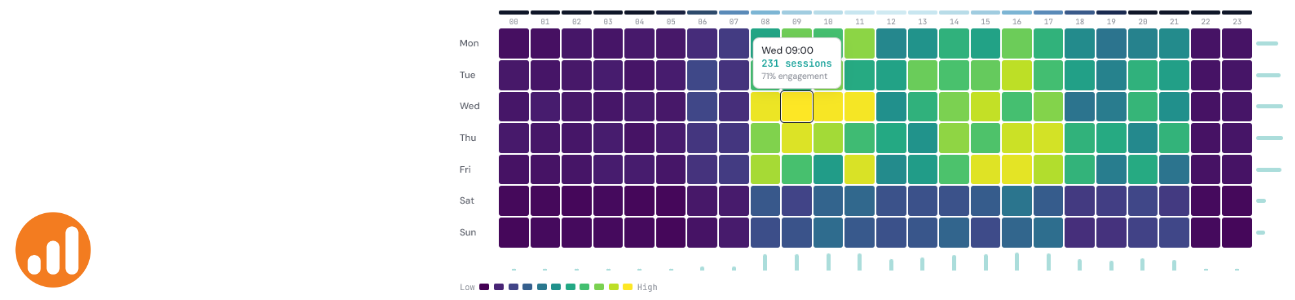
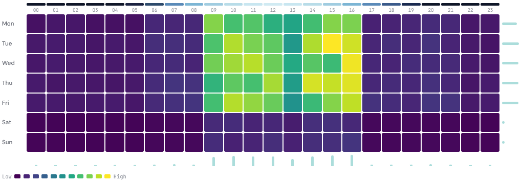
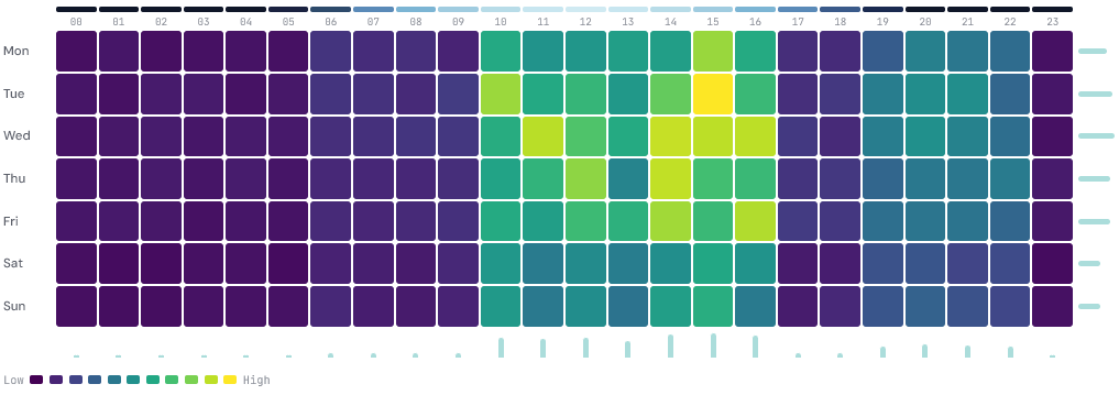
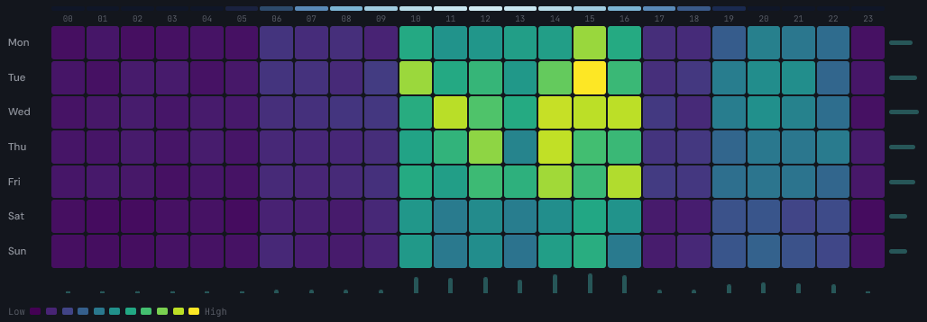
The Timing Grid takes your GA4 data and plots it as a heatmap with days of the week on the vertical axis and hours of the day (00:00 to 23:00) on the horizontal axis. Each cell in the grid represents one hour-and-day combination. The colour of each cell represents the metric value for that slot, from deep purple at the low end to bright yellow at the high end.
The format answers a question that flat reports and line charts handle poorly: not just when traffic is high, but which specific day-and-hour combinations consistently perform differently from the rest. A Tuesday at 09:00 might look similar to a Tuesday at 16:00 in aggregate weekly data, but the grid makes any difference immediately visible.
Data source
The tool connects to Google Analytics 4. Once connected, you can select any property you have access to and visualise six metrics across up to 12 months of data.
Google Analytics 4
Connect your Google account to pull in data from any GA4 property. Once connected, the available metrics are:
- Sessions - total sessions per hour slot
- Page views - total screen and page views per hour slot
- Users - total users per hour slot
- Conversions - total key events per hour slot
- Revenue - total revenue per hour slot
- Event count - count of a specific event, filtered by event name
The event count option works in the same way as the Seasonal Spiral. Enter any event name, for example generate_lead, add_to_cart, or a custom event, to visualise how that action is distributed across the week.

Filters
Beyond the metric selector, three additional filters let you cut the data in ways that are directly useful for scheduling and campaign decisions.
Channel narrows the data to a single acquisition source. The options cover all default GA4 channel groups: Organic Search, Paid Search, Direct, Organic Social, Paid Social, Email, Referral, Display, Affiliates, and Paid Video. Selecting a channel like Paid Search and comparing it against Organic Search, for example, can reveal whether paid and organic audiences behave differently across the week.
Device filters to Desktop, Mobile, or Tablet. Mobile traffic frequently peaks at different times to desktop, and if you are optimising for a specific device type, seeing the pattern in isolation is more useful than the blended view.
Date range covers Last 7 days, Last 14 days, Last 28 days, Last 90 days, Last 6 months, and Last 12 months. Longer ranges smooth out anomalies and give a more reliable picture of typical behaviour. Shorter ranges are useful for isolating the effect of a recent campaign or change.
Sample datasets
If you want to explore the tool without connecting an account, three sample datasets are available from the data source selector:
- E-commerce - simulated sessions data with strong weekday peaks and a Saturday afternoon tail
- B2B SaaS - simulated sessions with clear Mon to Fri concentration and low weekend activity
- Seasonal travel - simulated data with a different weekend rhythm and a more spread-out daily distribution
Connecting your Google account
The tool uses Google OAuth. Click Connect Google at the top of the tool, sign in, and grant read-only access to your Analytics data. The tool requests the minimum permissions required.
Your browser makes requests directly to Google's Analytics API using your access token. The data comes back to your browser only. DATA HIT's servers are not involved in that request or in storing the response. Once you close the tab, nothing persists. You can disconnect at any time using the Disconnect button, which revokes the access token immediately.
Walkthrough
- Go to tools.datahit.co/timing-grid.
- Select a data source. For GA4, click Connect Google first.
- Select the GA4 property you want to visualise.
- Choose a metric from the metric dropdown. If you select Event count, enter an event name in the field that appears.
- Optionally filter by channel and device.
- Select a date range.
- Choose a colour scale: Viridis (purple to yellow), Warm (deep purple to pale cream), or Cool (dark navy to pale mint).
- Hover over any cell to see the day, hour, metric value, and engagement rate in the tooltip.
View modes
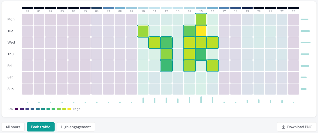
Three view modes are available below the grid to help focus on different questions.
All hours shows the full 7×24 grid with no filtering. This is the default and gives the most complete picture of how traffic is distributed.
Peak traffic highlights the cells with the highest volume values and dims everything else. This is useful when you want a clear answer to the question of when your audience is simply most active, without the rest of the grid distracting from the pattern.
High engagement highlights cells where the GA4 engagement rate is high. A slot with high sessions and high engagement is a strong candidate for scheduled content or ad delivery. Slots with high sessions but low engagement can signal that the audience arriving at that time is less qualified or less interested.
Colour scale
Three colour scales are available. Viridis is the default and works well for most data. Warm uses deep purple through to pale cream and can be easier to read in certain lighting conditions. Cool runs from dark navy to pale mint. All three use the same underlying value mapping, so the pattern in the data is unaffected by whichever scale you choose.
Light and dark mode
The tool supports both light and dark mode. Toggle between them using the button at the bottom of the page. Your preference is saved locally in your browser and applied automatically on your next visit.
Summary statistics
Below the grid, three summary figures are shown for the data currently displayed:
- Peak slot - the specific day and hour with the highest metric value, along with that value
- Busiest day - the day of the week with the highest total across all 24 hours
- Quietest day - the day of the week with the lowest total across all 24 hours

Downloading the grid
The Download PNG button exports the current grid as a branded PNG image. The export includes the DATA HIT watermark and renders at 2x resolution, making it suitable for including in reports or presentations.
Feedback and suggestions
The tool is in beta. If you have feedback, spotted an issue, or have a suggestion for a new feature, get in touch at hello@datahit.co.

